Forget tech or talent. Cybersecurity has a clarity problem. There’s too much noise, too little context, and too many decisions being made under conditions no one should have to work in. That's what Sekoia set out to fix from day one. For years, we’ve helped organizations stay ahead of threats.
Recently, AI changed the pace of our working processes, and the speed of attacks along with it. Teams now have more capability than ever, and more to keep track of than ever. Finding information isn’t hard. Knowing what to do with it (and fast enough to matter) is an entirely different story.
Sekoia has always had the same mission: make advanced cybersecurity simple and accessible, regardless of an organization’s size. What’s changing is how we deliver on it. We’re building the platform for the AI era, one that makes modern operations intelligible, trusted, and truly actionable.
As part of this evolution, we partnered with branding agency Bruno to develop a new brand identity and digital experience that reflects who we really are.
A brand built on clarity
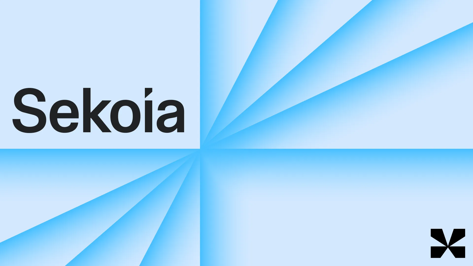
Clarity underpins everything we do at Sekoia. We provide the intelligence, and we help security teams make sound decisions. This principle shaped our new identity from the ground up.
Bruno’s art direction focused on the metaphor of radiance, especially the lighthouse. Picture it. A lighthouse in the dark, surrounded by stormy seas. It illuminates the landscape in every direction, so that anyone out there can clearly see (and avoid) danger.
That’s exactly what Sekoia does. Cyber operations might feel dangerous and murky, overwhelming even to the most experienced teams. Sekoia brings a continuous 360-degree beam that scans, reveals and orients, turning chaos into something you can act on.
That lighthouse imagery shaped everything in the design system.
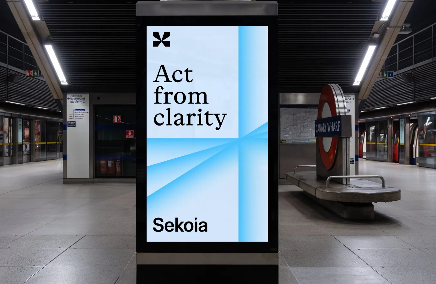
You’ll notice the patterns rotate and adapt like a beam sweeping the dark. The layouts are organised around the logic of directional light. The icon distils the whole idea into its simplest form. And the brand statement that came out of it, "Act from clarity", brings it all together.
A look that earns attention
Our strength lies in the combination of an open, interoperable ecosystem with AI-powered automation and a dedicated team of researchers and experts. To fully embrace this depth, Sekoia’s identity needed to go beyond visual conventions.
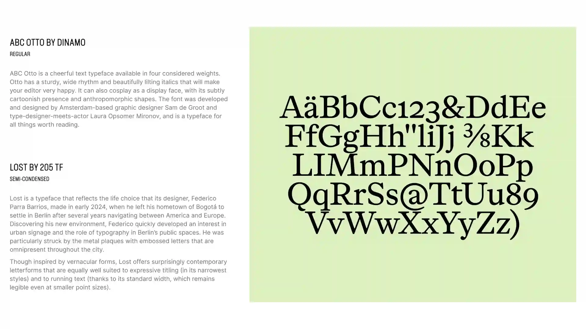
It all starts with the fonts. The serif type adds a sense of weight and seriousness to how we communicate; echoing the senior decision-makers we work with every day. And LOST, a typeface with engineering roots, reflects the technical depth of the platform, as well as the expertise of the Threat Detection & Research (TDR) team.
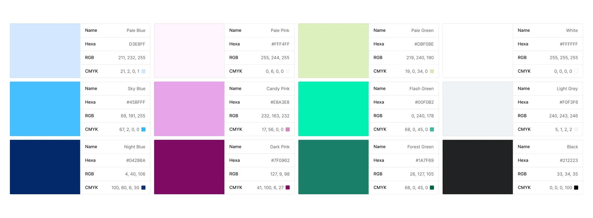
Then come the colors. Our palette extends this logic across multiple tones. The pastel base is complemented by neon tech variations for digital contexts, and darker ones for print and high-contrast applications. Because Sekoia is not one-size-fits-all. It’s designed to integrate with countless different tools and environments.
Finally, there’s our voice.
The Bruno agency helped us define a tone of voice that remains expert and educational, while breaking away from the overly polished codes of the sector. We don't want to sound like every other company, because we don't think like them either. We believe cybersecurity can be done differently, and we're not shy about saying so.
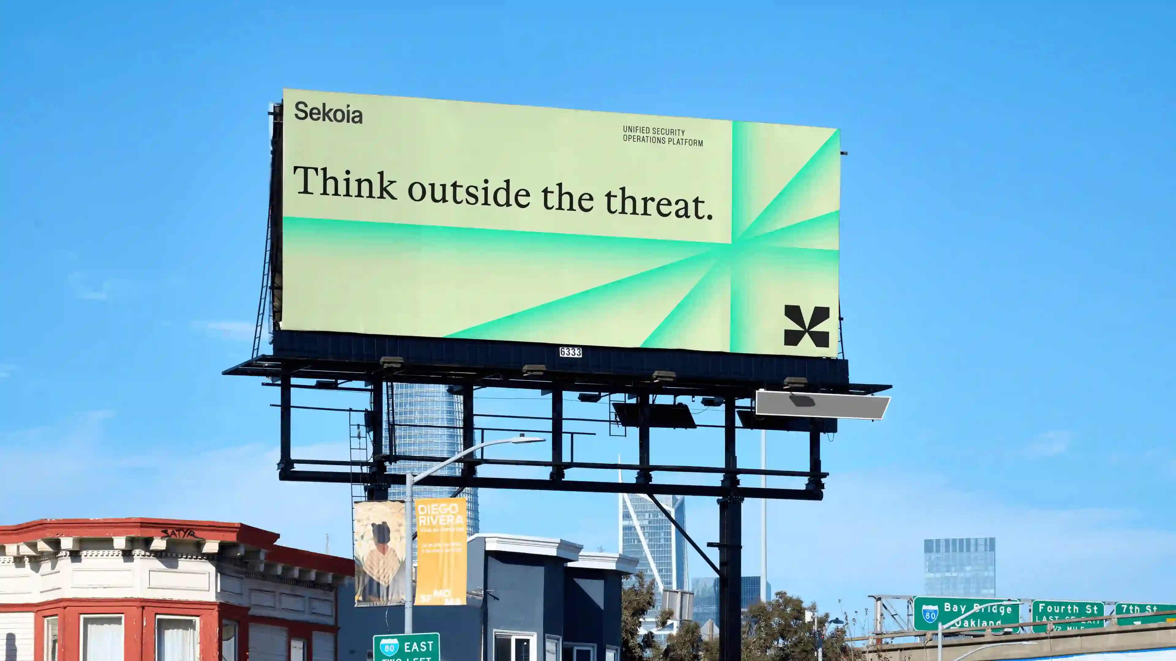
New Sekoia logos
Sekoia logo wordmark
Sekoia logo symbol
What comes next
We’re proud of how far we have come, and of what lies ahead.
This new identity marks a step forward, and anchors our vision: to build a new blueprint for modern security, built on clarity, and designed for the people doing the work.
Here’s to what comes next!